Using Colour to Your Advantage
Think “School Bus Yellow” and immediately your mind’s eye finds that exact colour. Certain combinations of colours can evoke strong emotional responses—like the colours of a memorable brand or your favorite sports team. Colour is a tool that can be employed to portray a mood, create a desired path of eye movement, apply emphasis, organize hierarchy, and the list goes on.
There are many variables that come into play when establishing a brand’s colour system. Take for example, the differences in online and print media. Selecting colour for online use is different than print, in that websites are displayed on a digital device, and the colour functions of those devices require use of a colour palette referred to as the RGB (red, green, blue) colour model. These three colours are combined in various ways to create the colours you see on digital devices and are expressed as a hexadecimal number that corresponds to a colour.
While the digital world has RGB and hexadecimal colours, the print world has CMYK (cyan, magenta, yellow, black). Branded merchandise such as clothing and apparel can add yet a whole other dimension to consider.
Consistency
Creating consistency in each interaction your customer has with your brand is an important part of conveying a credible, memorable message. When your iconic blue sways enough to be interpreted as purple, people take notice.
But even in the most colour conscious environments, colour will not always be an exact match when things like substrate types or print methods differ. And colour between digital devices can differ slightly from one to the next. So how is consistency achieved? Starting with carefully selected colour formulas, documenting colour systems in a brand guide, and implementation through a proper colour management workflow ensures consistency is optimal across print and digital mediums.
What colours to use?
Typically, one or two base colours and one or two accent colours are a preferable structure to work within. However, tastefully stepping outside of common boundaries can be the catalyst to setting yourself apart from the rest.
The use of accent colours can bring attention to “Call to Action” elements. The most important aspect of this combination is harmony. By choosing complimentary colours or pairing a colour with a neutral one for example, you can get combinations that are both appealing and legible.
The hue of each of these colours can dramatically change the effect on the viewer. A deep royal purple can provide a feeling of elegance whereas a light lavender colour may come off as more feminine and soft.
So how does one determine which colours to use? In addition to observing your industry and aiming for a unique palette, selecting colours based on their most common psychological associations is a good place to start. Here is a brief list:
Warm Colours
Red: Boldness, energy, passion, urgency, caution, affection
Orange: Enthusiasm, creativity, friendliness, emotional, fresh, autumnal
Yellow: Optimism, cheerful, youthful, active, approachable
Pink: Femininity, fertility, romance, edgy
Cool Colours
Green: Growth, health, tranquility, nature, reassuring, fresh, affluence
Blue: Stability, security, trust, peaceful, devoted, dignified
Violet: Regal, success, wisdom, wealth, honour
Neutrals
Brown: Organic, resourceful, timeless, robust, natural
Gray: Simplicity, neutrality, futuristic, calming
White: Pure, wholesome, cleansing, restful
Black: Sophisticated, elegance, luxury, edgy
Is your brand’s colour palette accurately portraying your organization with consistency?
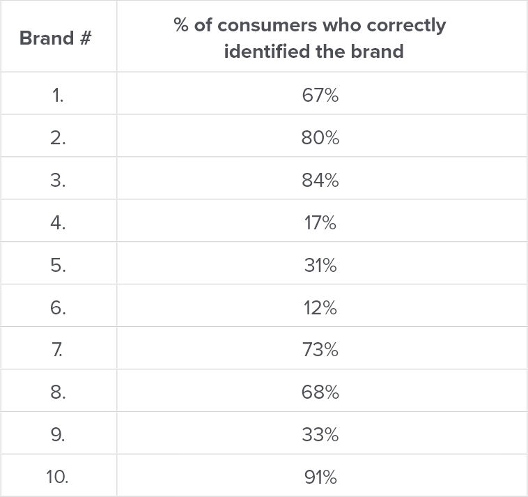
Can You Identify the Brand?
Below are some of the most recognizable brands in the world. Check your answers below. Compare your recognition capabilities with the results from the original survey in the table below.


