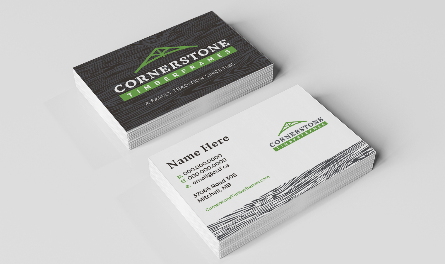
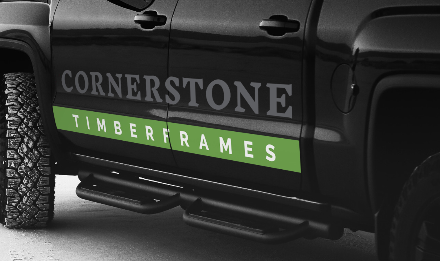
With the next generation at the helm, Cornerstone Timberframes needed to ensure their brand had a solid foundation that would serve them well for years to come. We helped them refresh their brand and redefine their niche in the marketplace. Needing to keep the name intact to leverage the existing brand equity they had built over the years, we settled on a new logo that kept a familiar structure while shifting to a green colour palette. The colour green is unique to the industry and a perfect symbol to encompass the living, environmentally responsible timber structures they create.
Services
- Logo
- Visual Identity
- Stationery
- Photography
- Website

Additionally, a ‘truss’ icon was developed that helps viewers instantly recognize the type of work Cornerstone specializes in and provides a graphic element that can be used in various branding applications.
The website was created with the intention of showcasing inspiration projects while educating users on the many benefits of timber framing. Through monitoring and analysis of website traffic and user flow, we soon discovered that users were looking for more. They wanted sample floor plans – something that didn’t exist yet on the site. In response to this compelling data, we were able to quickly develop a Styles & Plans page to cater to this need, further positioning Cornerstone as a leader in the industry by providing a rich content experience.

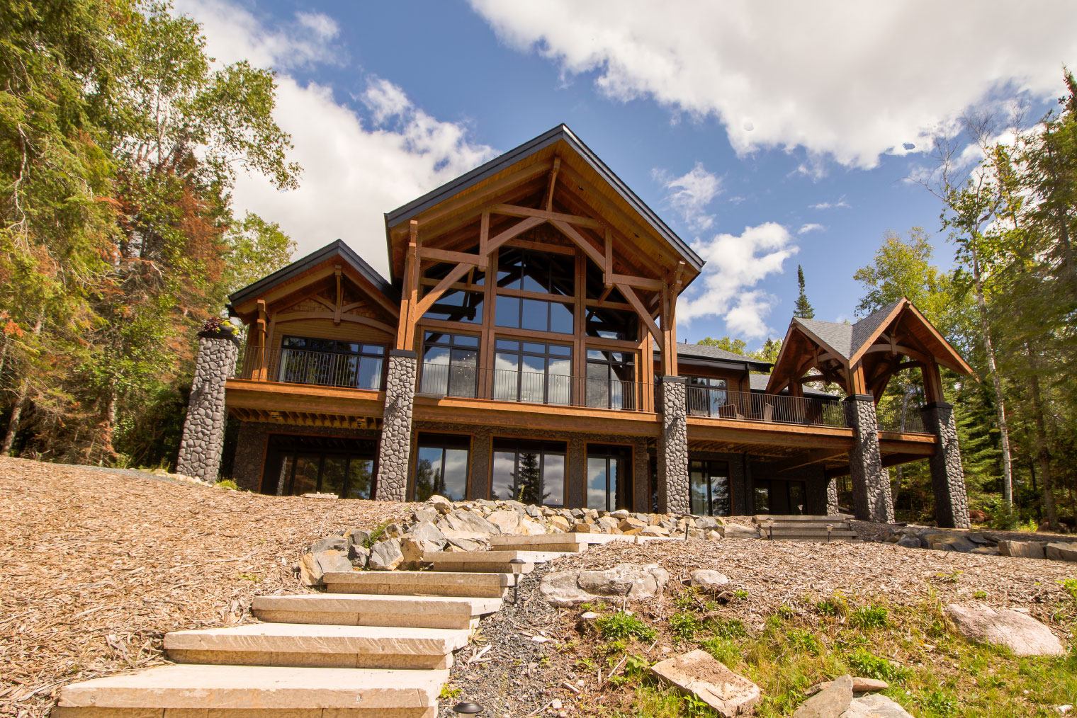
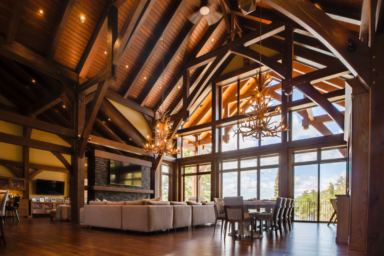
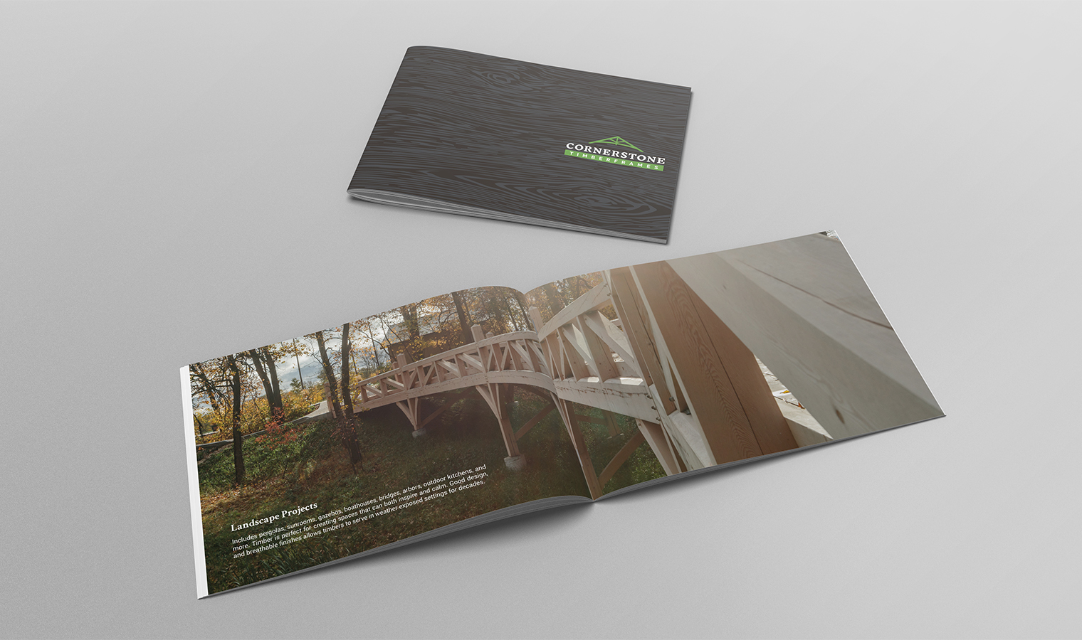
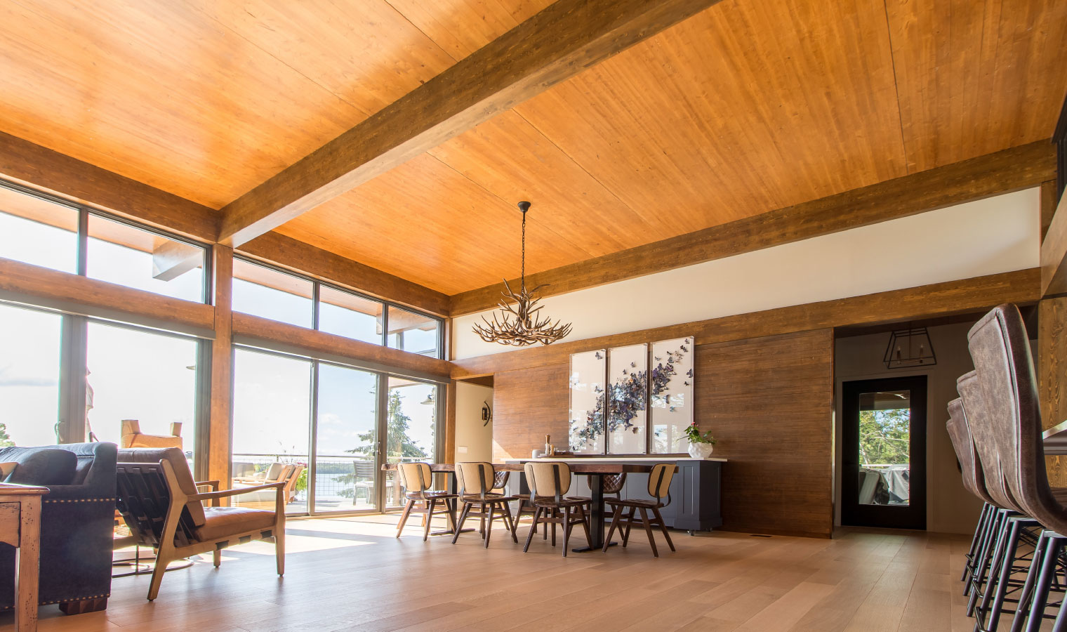
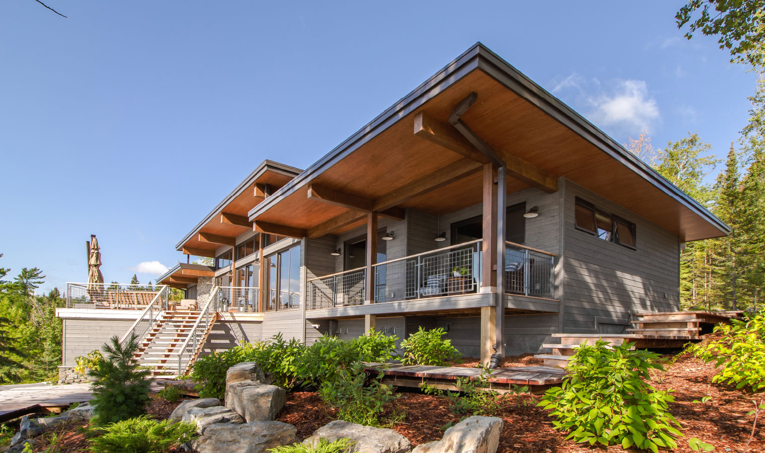
The foundation of great marketing materials is often great visuals, especially when the visuals speak for themselves. Cornerstone Timberframes has been designing and building breathtaking timber frame projects for over 25 years. Our team welcomed the challenge of capturing photographs of their unique projects, often traveling to remote locations and scurrying up sketchy ladders to capture a spectacular cottage project.
View Website


