Drought-resistant potatoes, blight-resistant cotton, raspberries that withstand harsh growing conditions — these are some of the many innovations that plant breeders have developed to allow more people in need to be affordably fed and clothed around the globe. Agronomix Software equips breeders across 40 countries with powerful tools to streamline their processes and stay competitive. The many customer groups in diverse cultures that Agronomix serves created added layers of complexity, so a calculated approach to portraying their identity was crucial.
Services
- Logo
- Visual Identity
- Stationery & Brochures
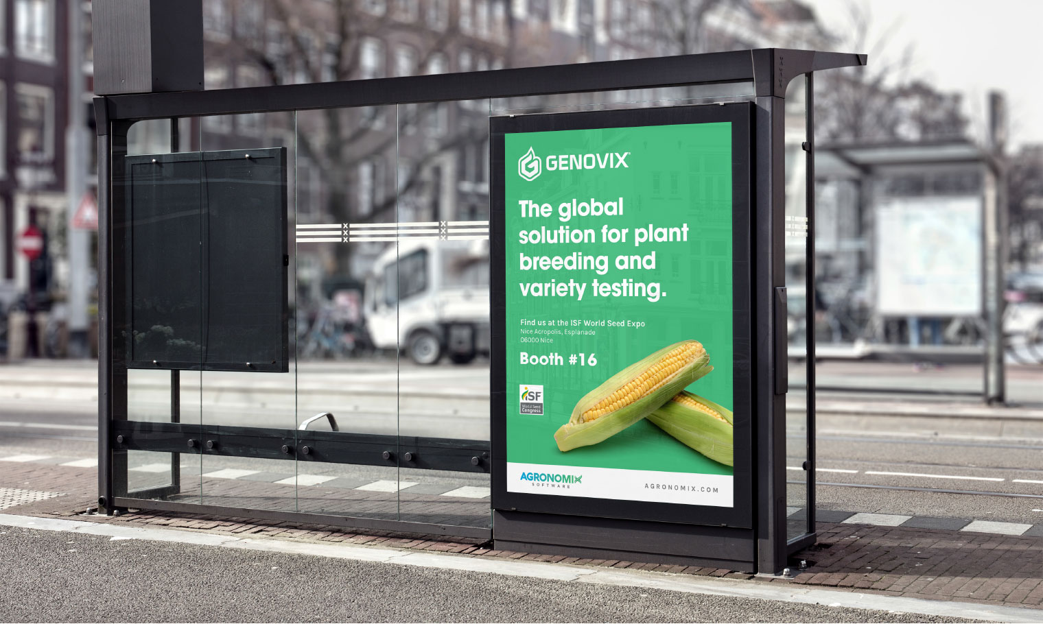
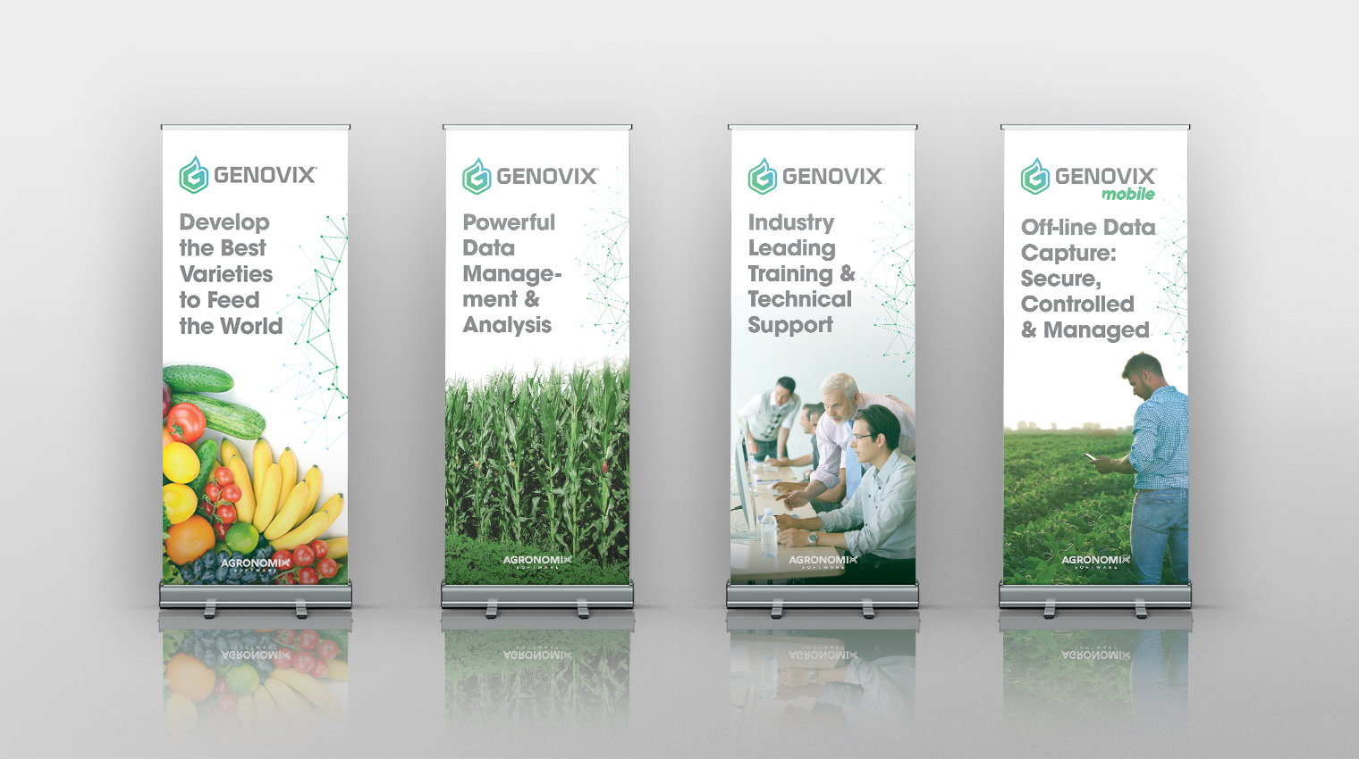
- Tradeshow Displays
- Video


The advanced, technical nature of the software solutions Agronomix provides inspired the modern, customized typeface used in the logotype. The healthy foliage that forms the ‘X’ icon acts as a universal representation of growth and prosperity. The blue hue symbolizes water, fuelling growth and the green hue symbolizes fertility.


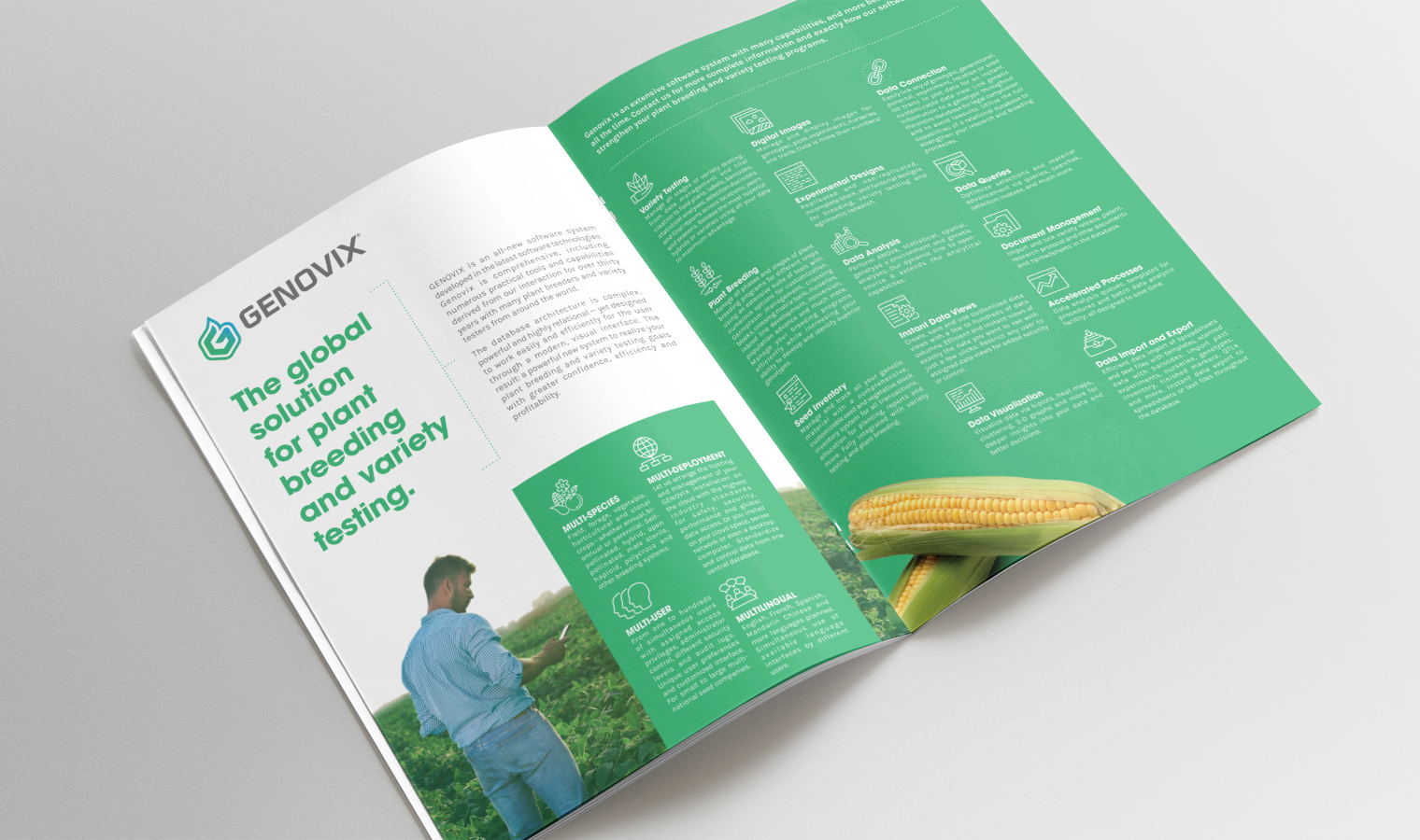
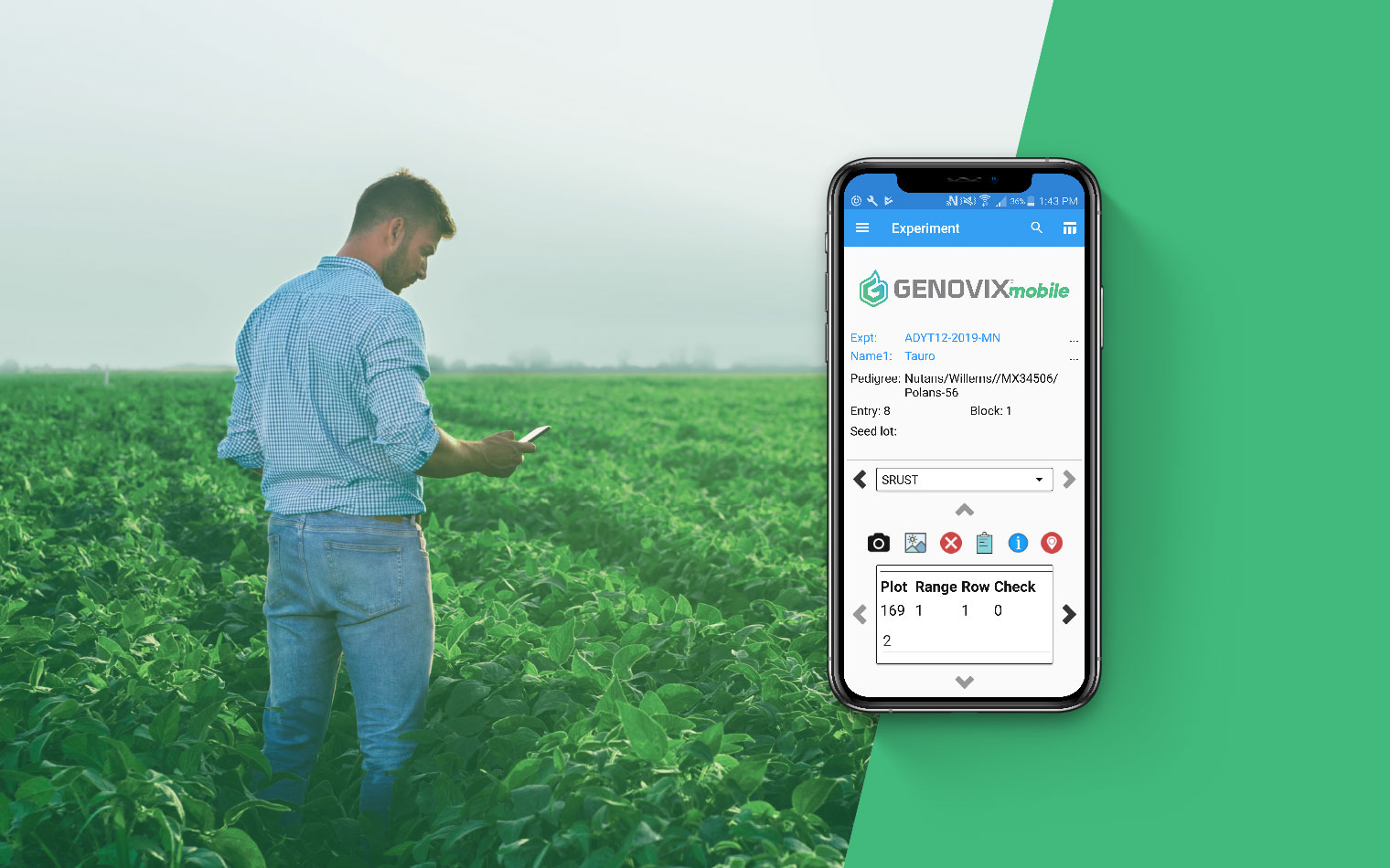
Genovix, the flagship product by Agronomix is an industry-changing tool that addresses the complex, data-laden processes of plant breeding and streamlines workflows while providing clarity, and as a result, prosperity. The shapes of molecular bonds inspired the ‘G’ icon from which the sprout originates at the centre, pointing in an upward direction symbolic of new growth.


Exploring the possibilities while minding the many constraints led us to boil things down to a clear, simple and memorable logo with guidelines on brand implementation to ensure a consistent, accurate message is portrayed at each touchpoint viewers interact with.


