Loewen Henderson Banman Legault (LHBL) provides honest and dedicated legal counsel to their clients through genuine relationships. Their roots trace back to 1974, with the current partners having run the firm for nearly 20 years. LHBL looked to us to provide a brand refresh that will serve them well into the future. This new visual identity was built to accurately portrayed their high level of expertise through a variety of updated applications.
Services
- Logo
- Visual Identity
- Website
- Stationery
- Custom Binders
- Signage

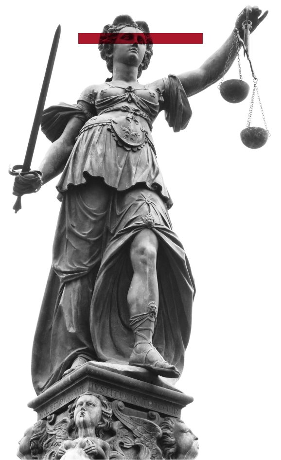
We found inspiration for the icon in the Roman personification of the moral force in our system of law: Lady Justice.
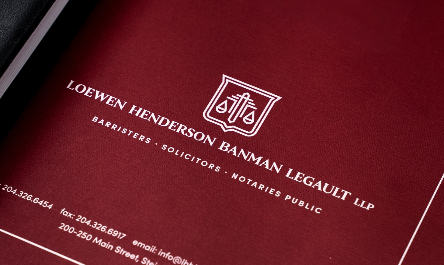
The clarity and legibility of the icon and typeface make for a versatile combination that is easy to reproduce. The typeface creates a refined, distinguished look, working in harmony with the bevelled shoulders of the shield.

SHIELD
Implies LHBL actively works to uphold the law as a defender of order in our society.

SCALES
Represents measurement of the strength of a case’s support and opposition.

SWORD
Refers to the authority of the law and our legal system as a whole.


The updated brand foundation carried through to a new website we designed and developed. To provide a clear visual reference, we also created a custom icon set representing each of LHBL's core areas of practice.

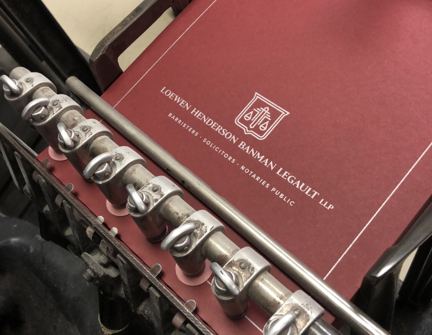

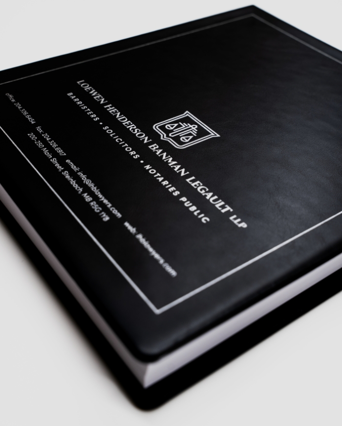
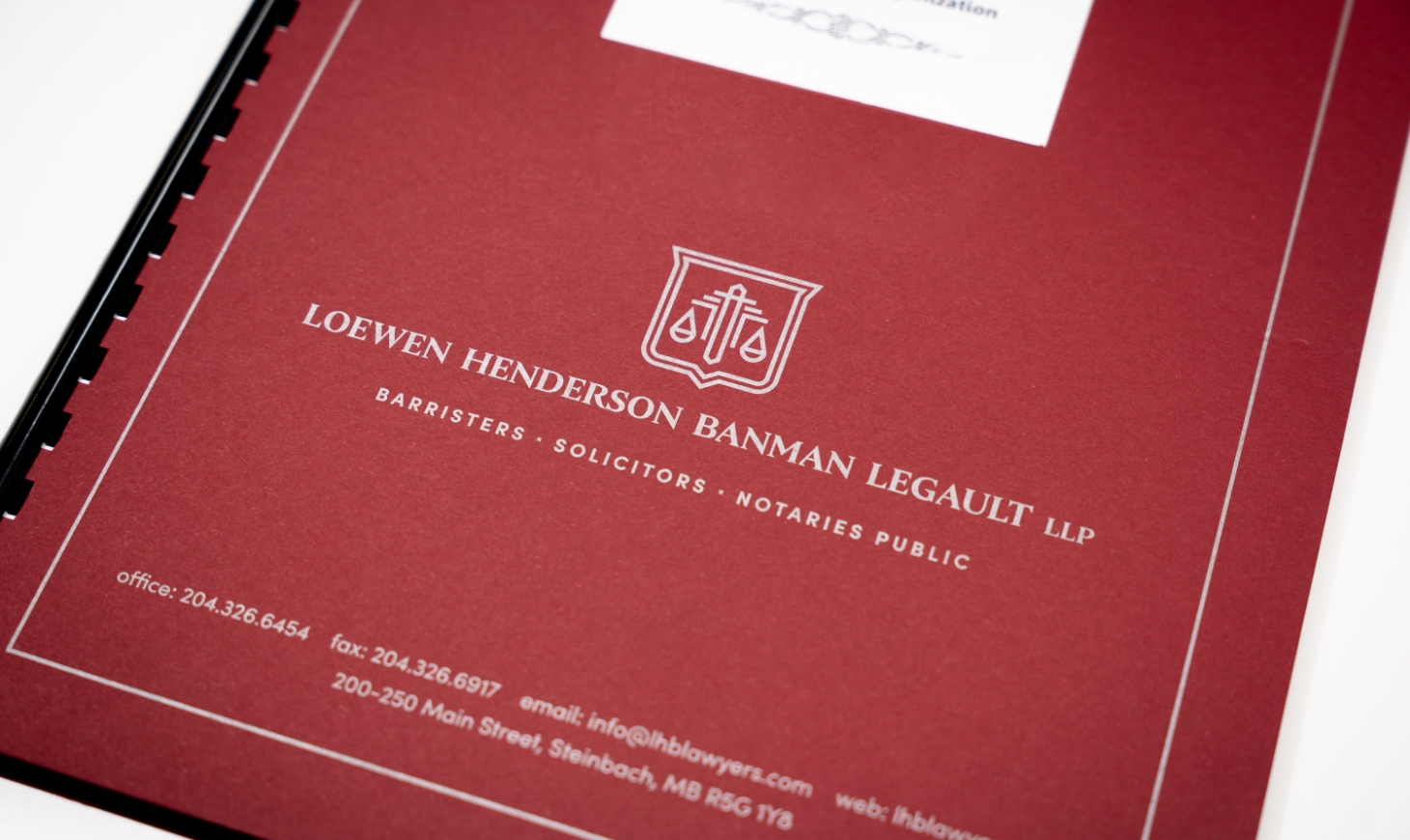
Report covers can be mundane, but not when they're produced on Mohawk Loop, Antique Vellum (in 80# Red Chili) with silver metallic ink and a custom die cut using our 1950's era Heidelberg Platen press. For larger documents, we provided custom black binders (also with silver ink branding), as well as premium faux leather minute book binders featuring their debossed logo.

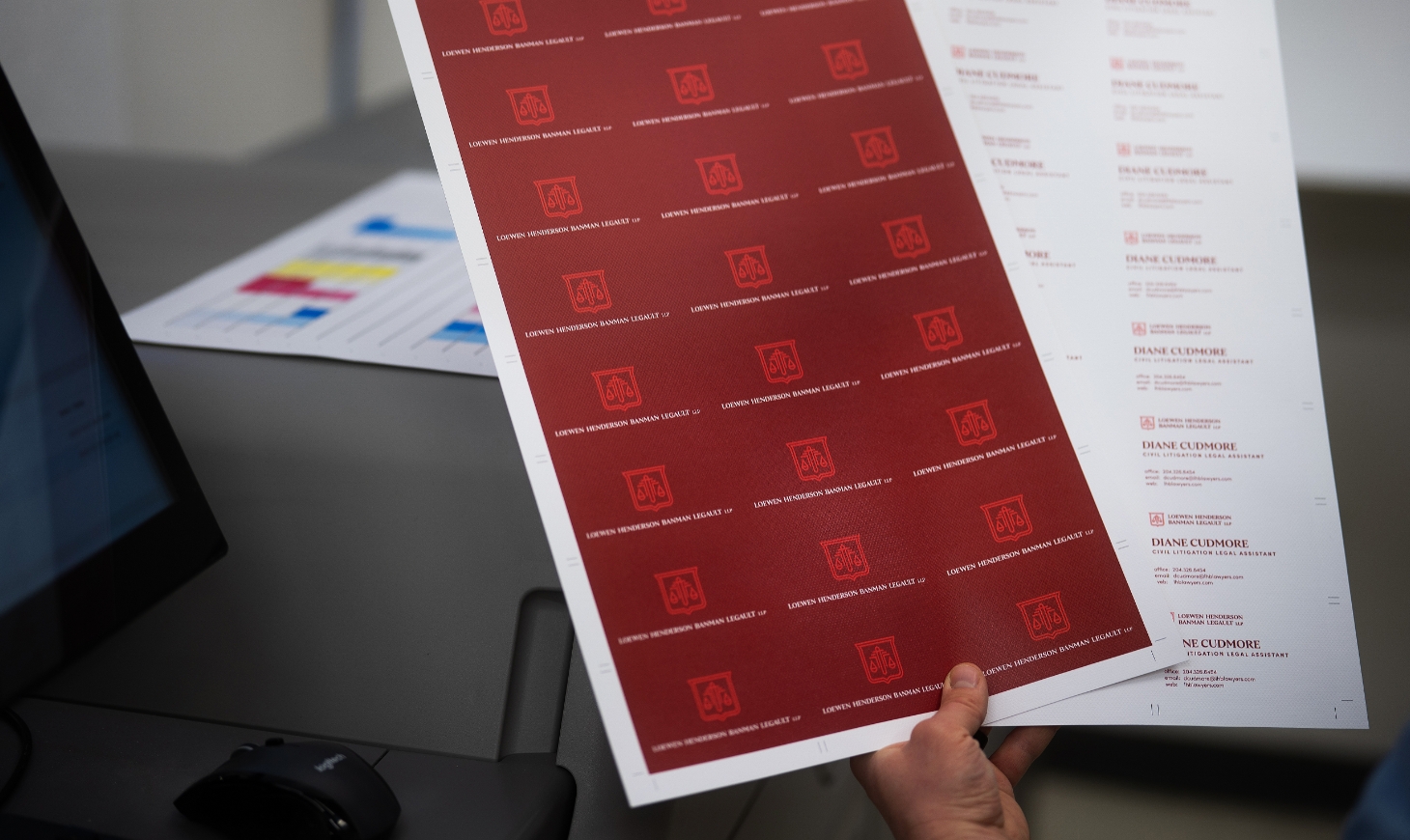
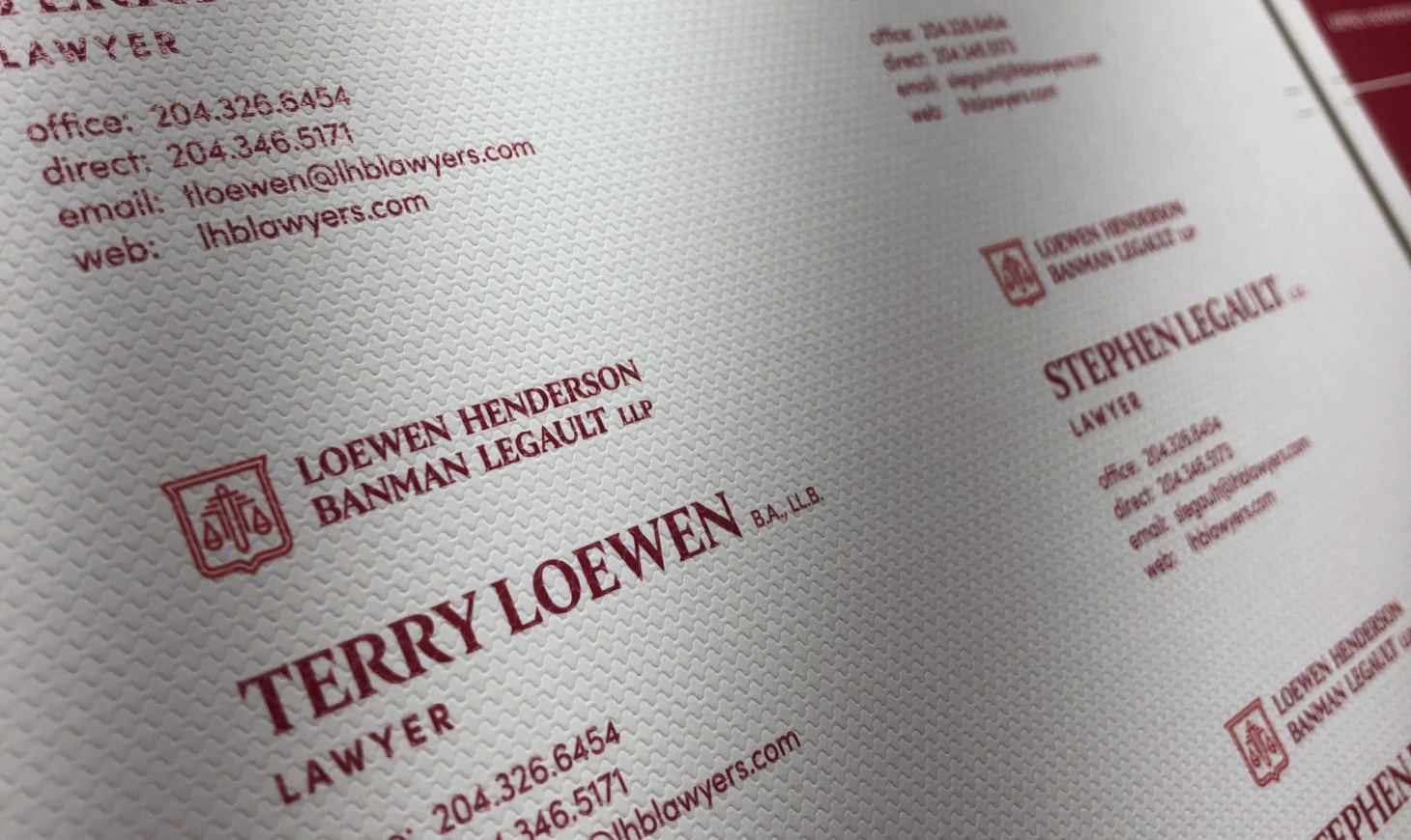
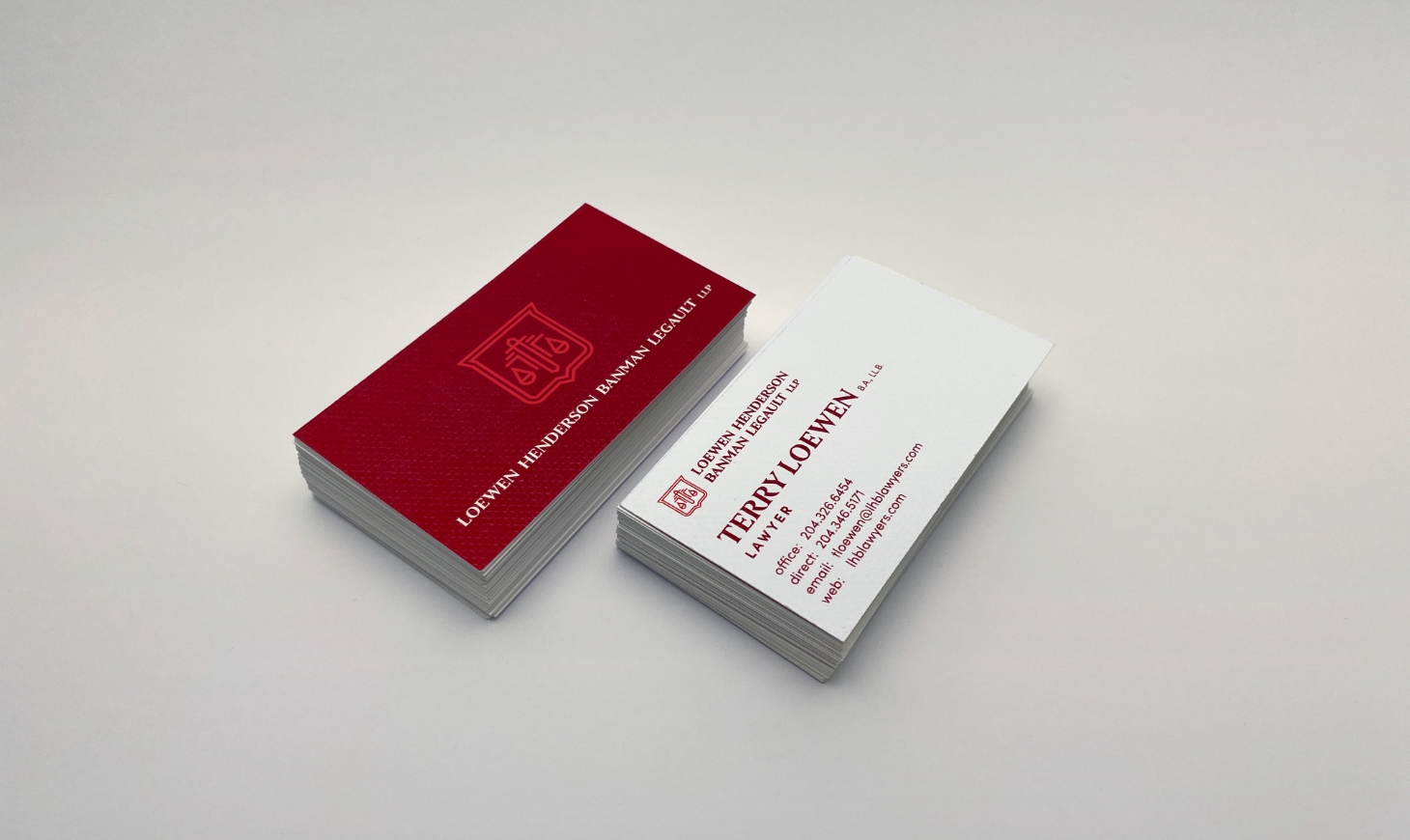
We printed new business cards on Neenah CLASSIC© Techweave, in 15pt Brilliant White. The subtle pattern provides a unique and powerful tactile impression, something likely finely woven fabric with a high-tech twist.
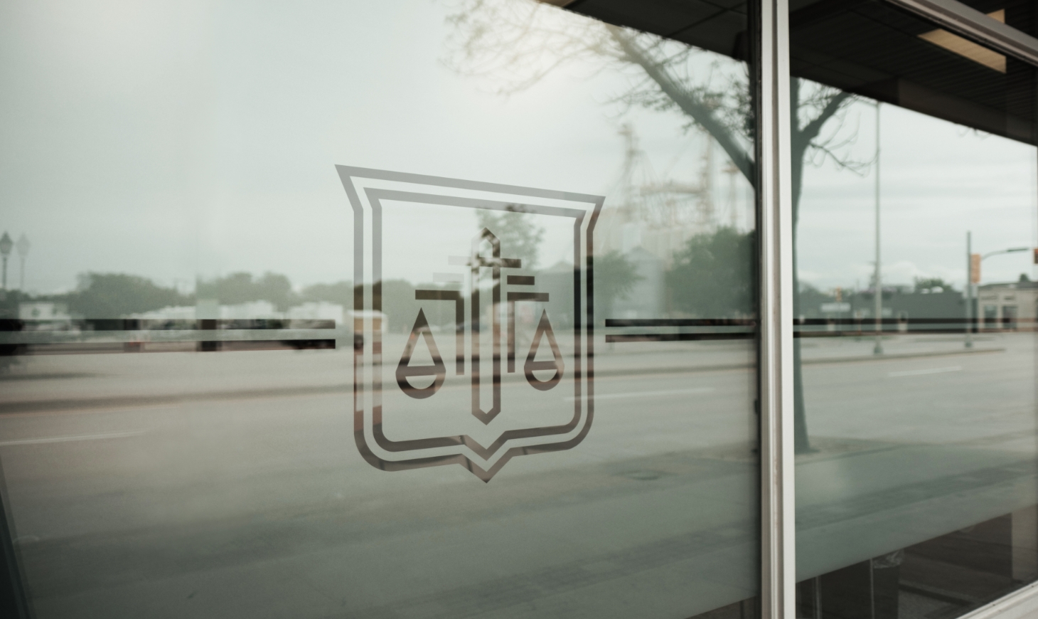
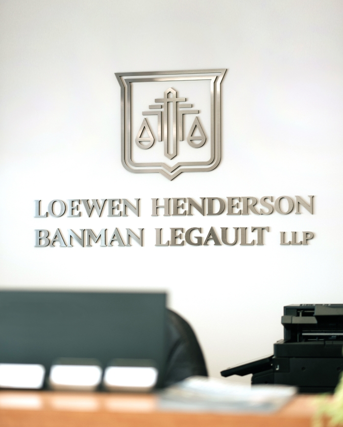
Updates to the signage at LHBL's location included new aluminum composite wayfinding signs, frosted window vinyls featuring the new badge, and a dimensional logo with a metallic finish installed behind the main reception desk.


An alternate representation of the logo has been developed in the form of this seal, encapsulating the icon with the names of each partner. The seal provides a more compact alternative to the primary logo, creating an official, authentic appearance, especially when embossed on letterhead or other legal documents.
View Website

